Website discovery project
, 23 May 2022
Hearing the voices of Amgueddfa Cymru’s digital users
We’re in the middle of an exciting series of projects that will reimagine how we serve our users digitally. We’re developing a fresh approach to our overall digital strategy, revisiting the systems that enable people to transact with us, and rethinking how we express ourselves online.
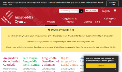
As part of this, we’re looking at the role our website plays. It’s served the museum for a long while and, although it has evolved over that time, we’ve reached a point where a more fundamental overhaul is required.
To kick off that process, we’re working with an agency called One Further. They’re helping us to develop a stronger understanding of how our website is serving our users and where there are opportunities to improve. Their outside perspective is useful because, working with it every day, our view of the website is likely to be somewhat distorted.
We’re also very aware that the new website must serve the people of Wales and provide a platform for engaging the communities that we work with (and those we want to work with more). For that, we need to hear directly from those people and communities.
That’s been a big part of the work that One Further has been doing for us. Here they explain some of the ways that we’re reaching out to hear the voices of our digital users.
The who and the why of a website visit
To capture responses at scale we’ve been using a variety of pop-up surveys across our website.
User intent surveys ask people about the context of their visit. Is it for personal or professional reasons? Is there a particular task they’re looking to complete?
Content engagement surveys ask people to rate the quality of a particular page and to suggest improvements.
Exit surveys appear when it looks like someone is about to leave the website. At this point we can ask them about the quality of their experience and what they might like to see improved.
Of course, these surveys can be obtrusive if not deployed sensitively. We make sure they only appear on the appropriate pages and don’t interrupt people who are in the middle of completing a transaction of some sort.
We make the majority of the questions multiple choice to keep completion rates high, and we don’t show people more than one survey during their session.
Optimising user journeys
We want to understand to what extent people are able to find information on the site quickly and easily. Is the layout intuitive? Are we using the right labels in the website navigation?
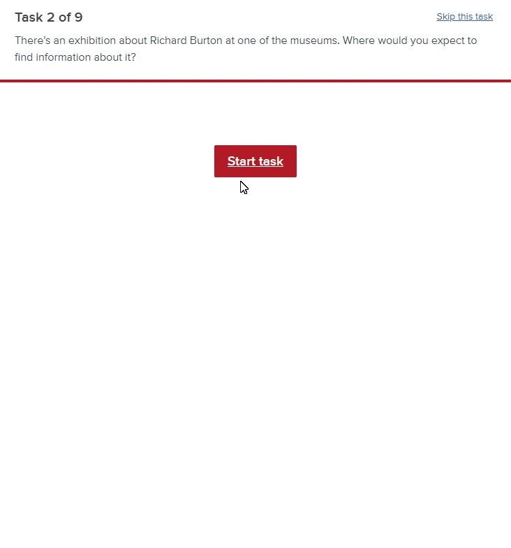
To test this, we use a tool called Treejack. It allows us to mock-up a website’s navigation and then set up tasks for people to attempt. These involve asking them to indicate where in the navigational structure they would expect to find certain information.
We then send a link out to people and wait for the results to roll in.
By asking people to complete typical user journeys on the site we can spot sticking points, dead ends, and obstacles.
If a significant percentage of people head off into the wrong section of the site then maybe we need to reconsider the ‘information architecture’. If people make it to the right section but then click on multiple options, maybe we’re not getting the labeling right. All of this is really useful feedback.
Digging deeper with one-to-one usability testing
Those two methods allow us to get really useful feedback at scale. We then balance that with usability testing on a more personal scale.
This involves talking to people one-on-one over Zoom. We ask them to share their screens while we give them a selection of common tasks to carry out on the site. Having the person there in front of us allows us to ask follow up questions to dig deeper into the choices and assumptions that we see playing out. Although when someone gets stuck on something it can be difficult to suppress the urge to lend a hand!
To make sure we were speaking to a representative sample of people, we used a recruitment pop-up on the website and sent people to a screening questionnaire. We then scheduled the session at a time convenient for them.
Pre-covid we would often do these tests in either a dedicated usability testing centre, or on-site at our clients’ premises. We’ve actually found that testing remotely comes with various benefits, in particular:
- The person taking part is able to use their own equipment, in their own environment, which makes them feel more at ease,
- Without no requirement to travel, we’re able to test with people who might not otherwise have been available, and
- If people cancel at short notice (or don’t turn up) it’s not such a big deal.
Make use of what we learn
Getting direct feedback from the museum’s audiences early in the process is incredibly useful for grounding us in how people perceive the website. That’s allowed us to have more informed conversations with people in various departments.
That feedback is also going to drive improvements to the website. In some cases there are some quick fixes to apply. Beyond that, we will be incorporating what we’ve learned into our broader recommendations for the future direction of the website.